Comments
board-man-gets-paid t1_iystkn0 wrote
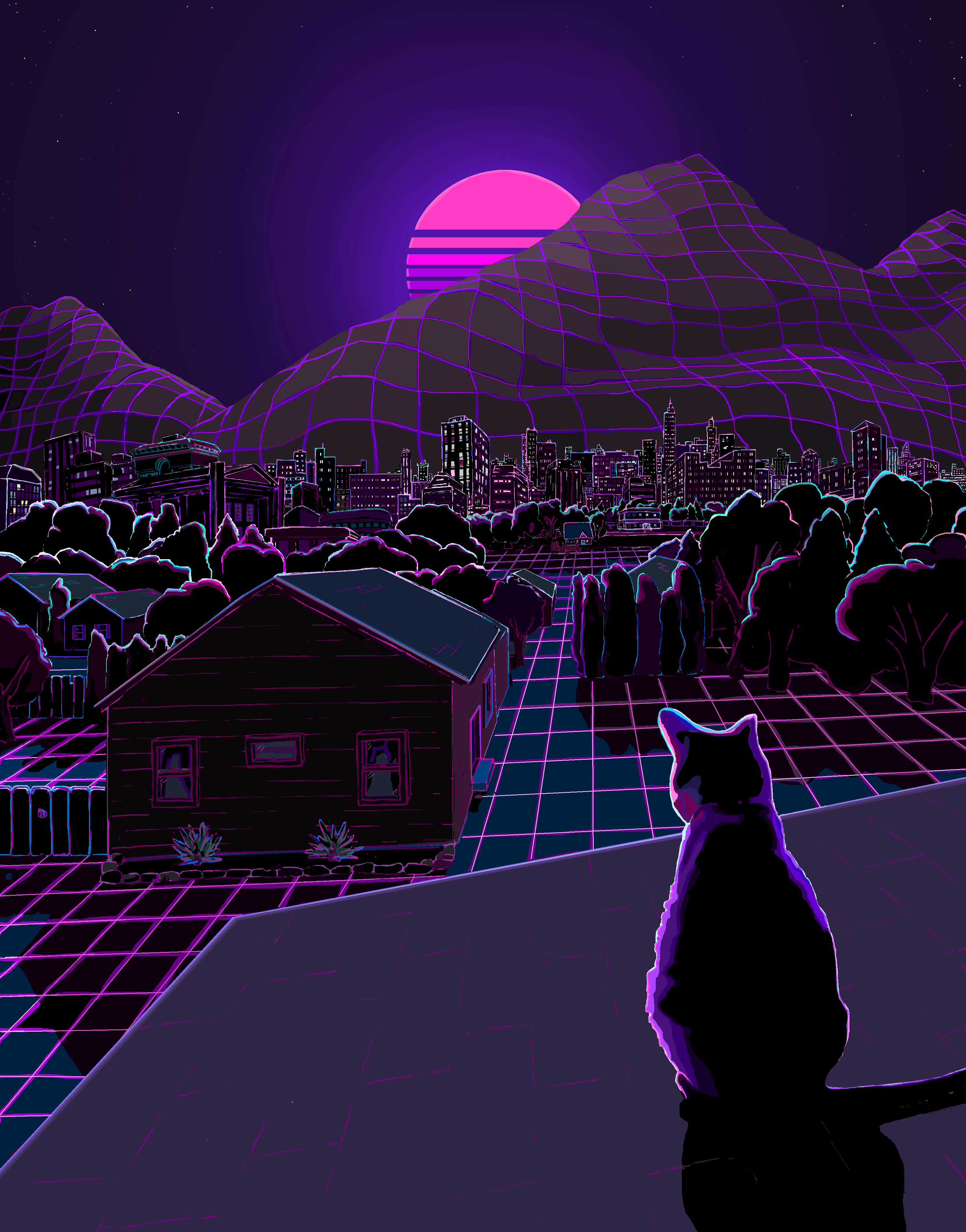
Looks great. Not sure if you’re looking for feedback but the one thing is I think the moon divisions take away from the composition. I’d go with just a solid moon otherwise great work
InspectorFadGadget t1_iyt1o21 wrote
I disagree completely, it would turn your eye's focus completely to the moon and nothing else, because of the solid and also bright color contrast compared with the rest of the world
Great work OP. Don't listen to this hooligan
board-man-gets-paid t1_iyt4mbc wrote
This doesn’t make sense to me. You’re saying the lines make the moon less of a focal point?
InspectorFadGadget t1_iyt5kb5 wrote
Yes. The rest of the world is full of straight lines. The moon is the brightest object in the piece, by a lot. And circular. Breaking up what would be a solid bright pink circle by easing into it by emulating the "liney" makeup of the rest of the world makes it not blast you with pink moon-ness, and allows you to naturally want to look at the rest of the world, and cat.
MandyBeal123 t1_iyt6acn wrote
I am completely in love with this.
board-man-gets-paid t1_iyt6e1o wrote
The terrain is laid out on a grid that doesn’t mean everything else is just lines. The negative space in the moon is distracting to me in what is otherwise a fairly realistic comp that just has a grid overlay. Just seems out of place and that’s my two cents. You can respectfully disagree but don’t think the word hooligan is appropriate for what was merely feedback
InspectorFadGadget t1_iyt7rud wrote
Art is art and everything is subjective, of course you're entitled to your opinion on what would improve the piece for you.
However, the definition of hooligan is not subjective. And everyone here knows that you are originally, a member of a South London gang of young street rowdies said to have been led by one named Hooligan, who indulged in boisterous horseplay and breaches of the peace; hence, any street ruffian, especially one who is a member of an organized gang; a ‘hoodlum.’
board-man-gets-paid t1_iyt7zne wrote
Not sure how that last part applies here lmao
Filthwizard_1985 t1_iyt9suw wrote
Love this. Looks like an alternate cover for 'Stray' or 'Gunship'.
Sultan_of_Swing92 t1_iyuac90 wrote
You did this on MS Paint?! That’s better than the stuff I make on Procreate. Great job!
d0ne_by_the_g0ds t1_iyuf5zg wrote
This is so pleasing, belongs here r/eyebleach
UDPviper t1_iyvw1g2 wrote
Yes. Everything in there has lines, except for the cat. Which is the real focal point. Whatever doesn't have lines sticks out.
UDPviper t1_iyvw4wa wrote
You're an art hooligan. That's a fact!
board-man-gets-paid t1_iyvy6cp wrote
I’m not sure you know what you’re talking about
board-man-gets-paid t1_iyvyjdr wrote
The trees are organic. The city in the background doesn’t appear as “lines” it looks more organic because of the mosaic of lights.
And the focal point is the moon. It’s the first thing that draws your eyes
BastardFromABasket87 t1_iywmbyh wrote
I ate an ounce of mushrooms once and that's exactly what everything looked like, only a little brighter.
SRMasaryk OP t1_iywybsi wrote
Thank you! Yep, MS Paint is all I know.
SRMasaryk OP t1_iywzspz wrote
Great discussion, the input is endlessly valuable so thank you. This was an attempt to have a "Synthwave" sort of feel.
Interestingly, I showed some friends this and they instantly started debating over the moon (or sunset) as well.
board-man-gets-paid t1_iyx2xby wrote
It’s not a sunset. Has to be a moon based on the color of the brightness of the sky/lack of color gradient you’d see in a sunset
magnelectro t1_iz5x7s4 wrote
/r/outrun moon...

SaradominSmiles t1_iysrwcr wrote
This is so soothing, I love it!